|
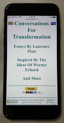
With that said, the purpose of this optimization project is to determine which displays can be presented more appropriately on mobile devices which, as we all know, have smaller screens than my state of the art IBM aka Lenovo L440 laptop computer on which I do all my creative work, and then dynamically deliver those optimized displays, leaving the content of the essays themselves wholly intact.
Because of that, it has (of necessity) morphed into an ongoing work, to which I invite you to contribute. In what way, Laurence? In this way: if, when you view this newly optimized Conversations For Transformation website on your mobile device, you notice features which don't work as well as they should, please let me know and I'll consider fixes. OK, why don't they work now ie why don't they already work at the get-go, Laurence? You make it sound like you're only delivering a half-baked product, no? And well may you ask.
There are so many computer types, so many devices, so many brands, so many protocols, so many operating systems (of which there are so many releases and versions) out there with mobile browsing ability, that for all intents and purposes, it's practically impossible to test all combinations of all them. So I invite you, if you notice the website is not working on your mobile device the way it should work, to please e-mail me. Be prepared to provide answers to questions about your particular configuration. I'll assess if I can put a fix in place. Sometimes I can't (I can't fit the Eiffel Tower into your living room, for example). But if I can, I'll implement a suitable one.
Although this website now comprises one thousand five hundred and forty five pages (two thousand seven hundred and ninety six files in total) (ie so far), optimizing it for mobile requires updating only one of them. That one is the .css (Cascading Style Sheet) file, for those of you with a technical interest. And given there's only one such file to update, if any changes are going to be made at all, they can be implemented quickly and easily, then made available online almost immediately.
